
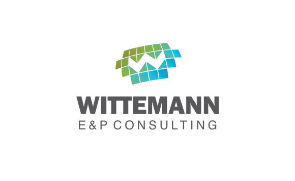
Logo design: Since the client worked in the E&P sector, their work involved the use of geographical maps with lines and coloured areas. Hence, the idea for the logo emerged from that and I have used gradients of blue, green and yellow to resemble the earth and the slight curve in the squares to make them appear as if they are plotted on the globe.
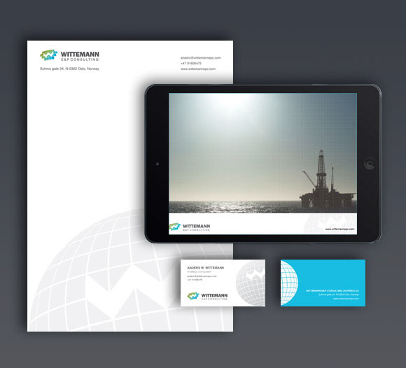
Letterhead, visiting card and presentation template design
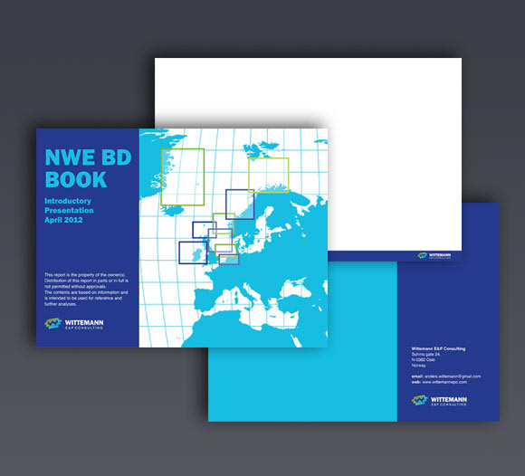
Brochure cover and back page design.